The Artisan Branding Co | Kaitlin Ferguson
Kaitlin Ferguson is Norwich based artist. This project included Logo Design & Brand Identity for Kaitlin’s website, studio and marketing materials. Read more about this project here.
KAITLIN FERGUSON STUDIO Norwich, Norfolk


Logo Design - Brand Identity
ABOUT KAITLIN FERGUSON
Kaitlin Ferguson is a Norwich based interdisciplinary artist. Her work explores the environment and The Anthropocene - a name given to our current geological era and the effect that one single species has become the over-arching planetary shaping force.
As Kaitlin explains “It is through creative applications, that I seek to disrupt the current human centric viewpoints and reframe these perspectives within the deep time scales of the planet. To reveal new readings of the environment; ones that seek to deconstruct and heal the deeply embedded divides between nature and culture which surround us”.
THE PROCESS
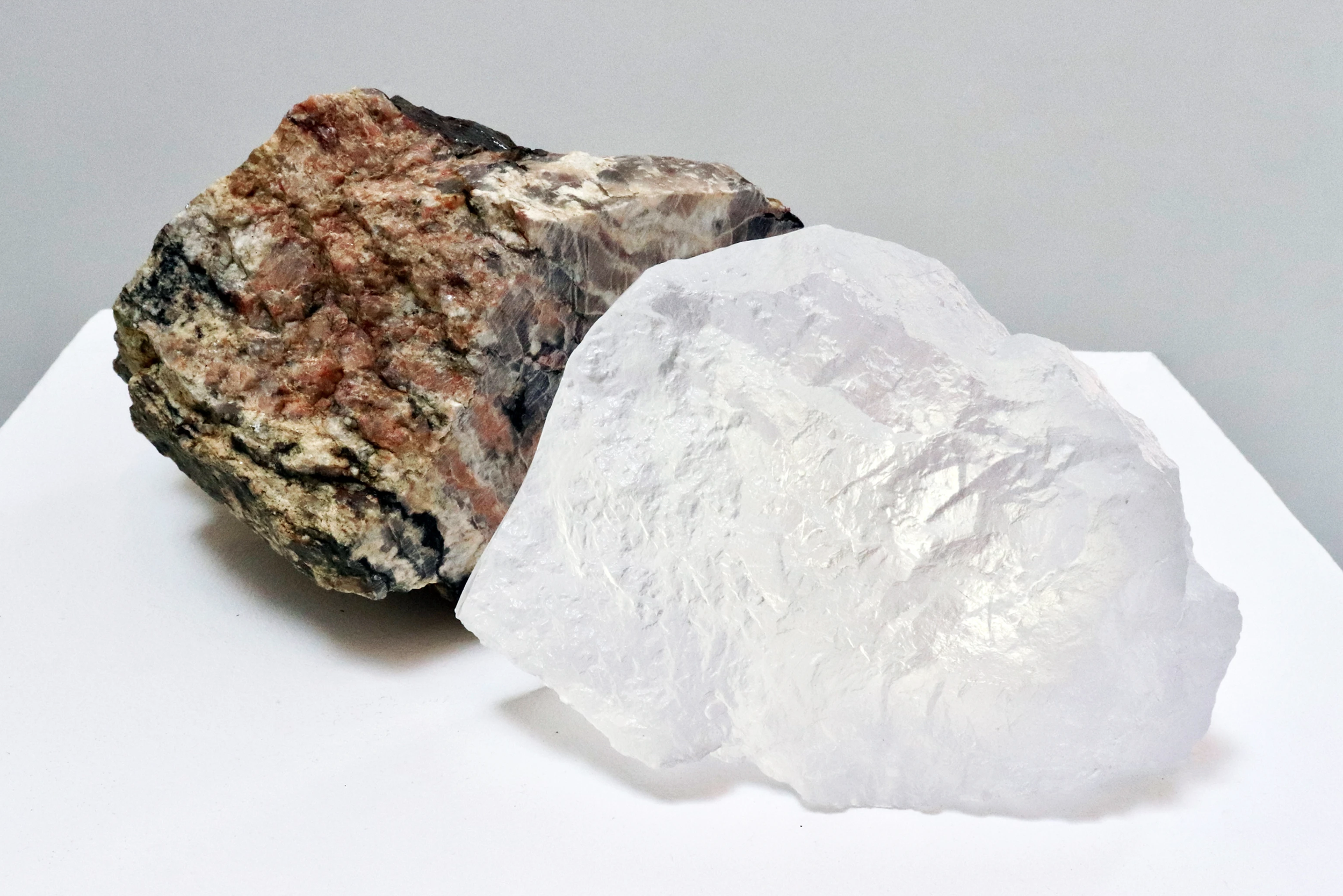
Kaitlin contacted me Autumn 2020 keen to create a logo and simple identity that would sit alongside her work. I was keen to work with Kaitlin as I had a personal interest as a child collecting semi-precious stones and minerals, so between us we had a great understanding and connection which made the process even more exciting. Researching and developing a moodboard was a free flowing process that would shape the new brand.
Key themes that I explored were based around organic forms, geology and contour lines found within maps, indicating different ground levels across the planet.
The logo needed to be clean, modern and timeless to highlight Kaitlin’s strong aesthetic and give identity for a new studio premises, website and exhibition materials.
A bold but understated typeface was chosen (Neuzeit Grotesk) which was strong enough in isolation and compliment a simple brand mark icon. For the main icon I designed an abstract circular symbol representing earth, its layers and future challenges faced.
For the brand identity, a simple colour palette of black, white and rust were chosen which would work well with specialist print finishes such as de-bossing and hot foil.
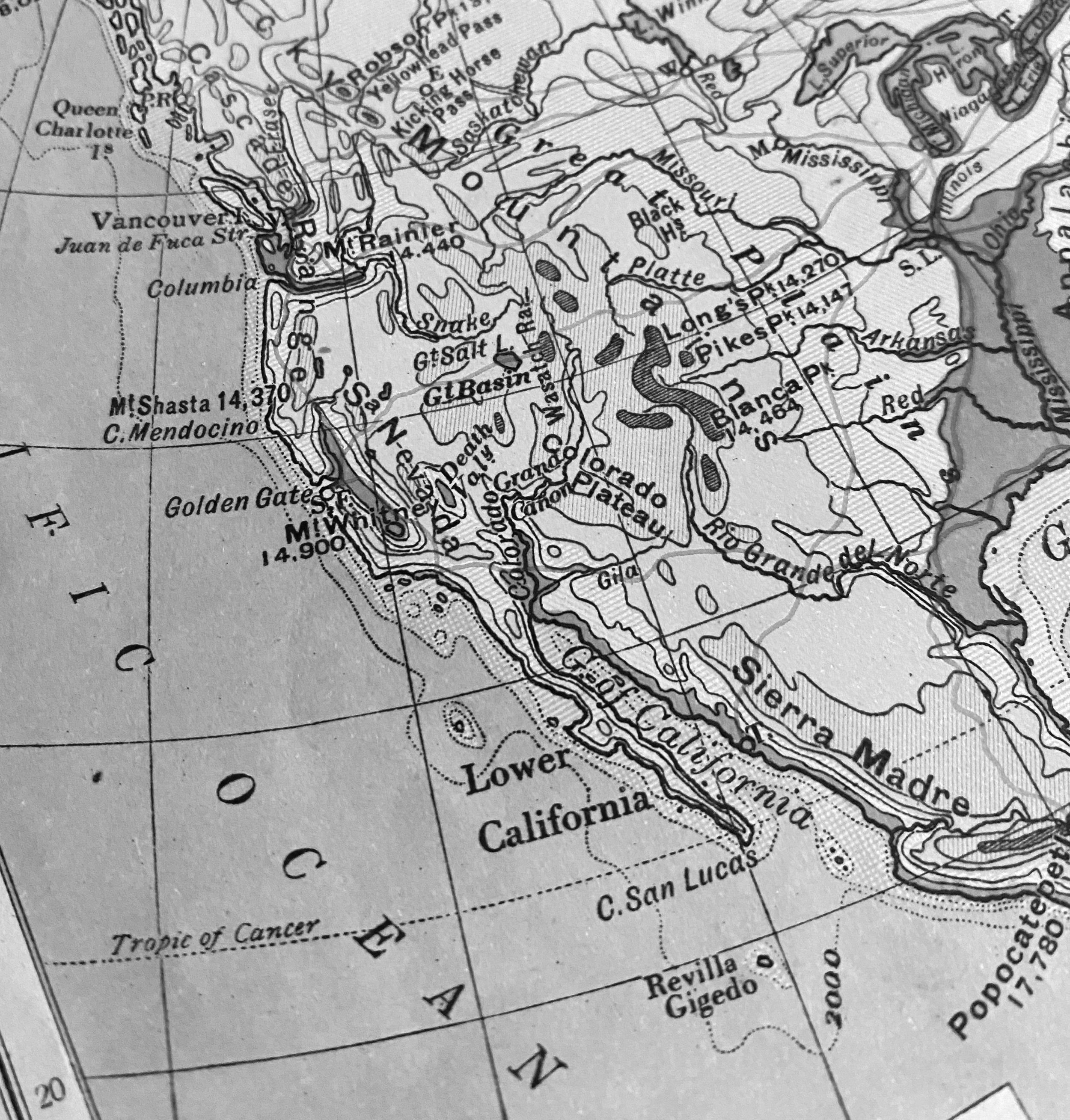
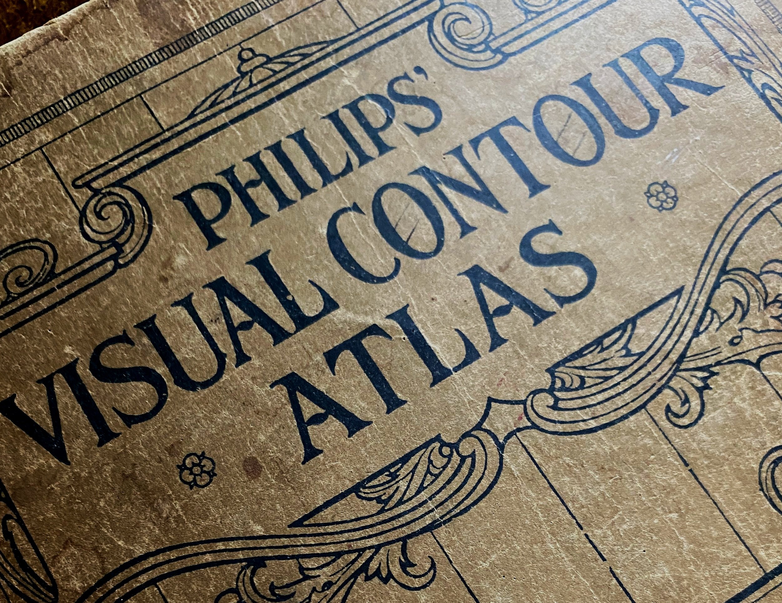
As a collector of books, I had previously sourced a vintage Philips Visual Contour Atlas. This project felt very fitting to this special book from the 1920’s so was used to inspire my process and provide contour detail of Kaitlin’s birthplace - California.
I am always keen to bring a personal element to any brand so worked with the shapes and the exact contour lines of California which were later illustrated to create a bespoke pattern that could be used as a subtle hint across print and digital applications throughout the brand.
The finished identity and logo felt at home alongside the range of artist works.
To see more of Kaitlin’s work, check out her instagram here or website here.