These Country Roads
These Country Roads, Norfolk. Logo & Branding for These Country Roads providing videography & photography. The visual identity included logo design & monogram, icon illustration, brand typefaces and colour palette.
THESE COUNTRY ROADS Norfolk


Logo Design - Brand Identity - Illustration
ABOUT THESE COUNTRY ROADS
Jasmin White is the face and talent behind These Country Roads (TCR). She is a lifestyle photographer and videographer based in rural Cambridgeshire. Working with a range of luxury brands to create engaging, high end video and static marketing content.
“My photography style is rustic, earthy and organic. I’m all about capturing reality over perfection, evoking mood and emotion with each moment captured. Whatever the brief, I always look for that little bit extra to capture the emotional essence of my subject and tell its story in a visual way.”
Jasmin White
THE PROCESS
Jasmin was after a hand crafted rustic feel to showcase her business. Her old branding lacked feeling and we agreed a new logo and visual identity was needed that linked more closely to her work and client base.
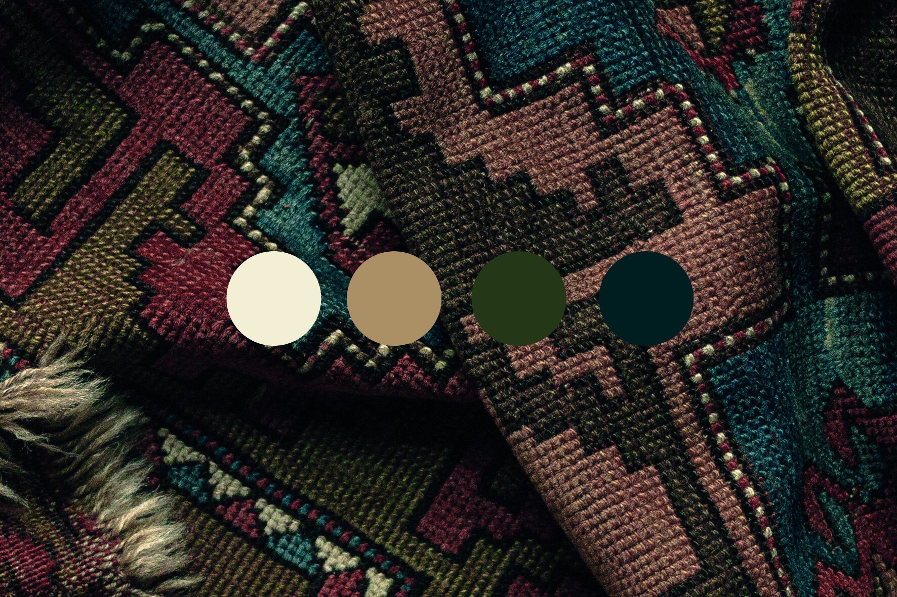
The work of TCR features warm, caramel and earthy tones. I wanted to develop a complimentary colour palette that worked with existing tones and enhanced the work. The new palette was developed with inspiration taken from antique packaging, log cabin style interiors and old Western influences. A deep marine blue reminiscent of dark woodland lakes, an antique white and dark pine shade completed the brand palette.
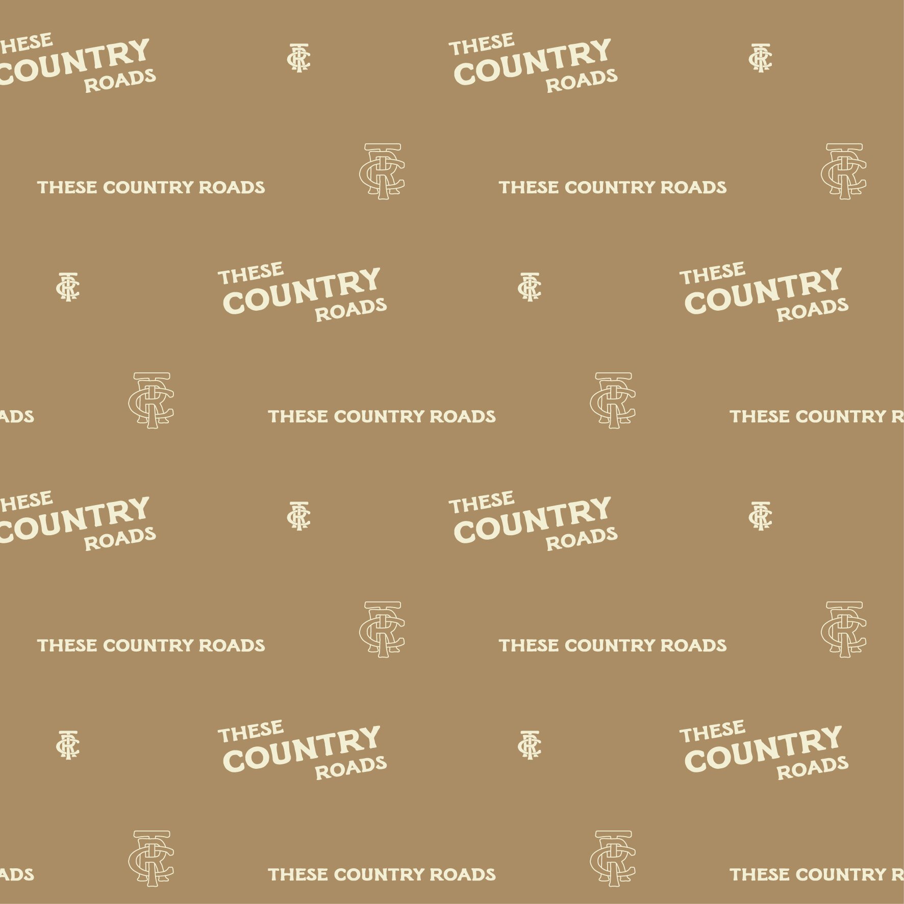
As part of the logo, a monogram was designed to use as a stand alone icon and two main wordmark logo variations were designed so there were options available to use across different touch points. The typeface was designed by illustator and designer, Taylor Penton. With its organic and rounded serif type this lent itself to the Americana feel that was highlighted in the initial brief.
Hand drawn illustrated icons were also developed as part of the identity to showcase the different area’s of the business from brand photography to upcoming studio sessions and workshops taking place in a purpose built cabin.
It has been a pleasure to work with the talented and inspiring TCR to create this warm and rustic identity.
Thank you Jasmin.